

A practical guide to creating psychoeducation handouts for Australian practice — clear, credible, and designed for real clinical sessions.
There is no shortage of psychoeducation handouts online. The problem is that many of them are either too academic to use with clients, too simplified to feel clinically useful, or too visually messy to inspire confidence.
A good handout should reduce explaining work, not create more of it.
When a resource is strong, it helps the clinician teach a concept quickly, gives the client language they can actually use, and reinforces the therapeutic tone of the session. That combination is why high-quality handouts remain one of the most attractive categories on PsychVault.

Before thinking about colors, icons, or formatting, ask one question:
At what exact point in therapy would I hand this over?
That question makes almost every design decision easier. If the handout is meant to:
then the wording, length, and complexity should match that moment.
The best handouts feel anchored to a real use case, not to a generic content idea.
For a broader overview of clinical resource types, see Psychology templates for therapy, assessment, and NDIS work. If you are creating resources for autistic or ADHD clients, the neuroaffirming templates guide is the natural next read.
Trying to cover too much at once usually weakens the resource. One strong concept with a few concrete examples is often more valuable than five half-developed ideas squeezed together.
Clients need clarity. Clinicians need credibility. The sweet spot is language that is simple without becoming flat, childish, or over-sanitised.
People scan before they read. Distinct headings, short sections, and good spacing reduce cognitive load immediately.
The handout should feel like an extension of the clinician's work, not like a random internet printable dropped into session.
The strongest psychoeducation handouts feel calm, specific, and useful within seconds.
If you want a reliable framework, start here:
This structure works because it moves the reader from recognition to understanding to action without demanding too much effort.
For many therapy or psychoeducation resources, these elements are worth checking for:
If the handout does all of those things, it is usually already ahead of most generic worksheets online.
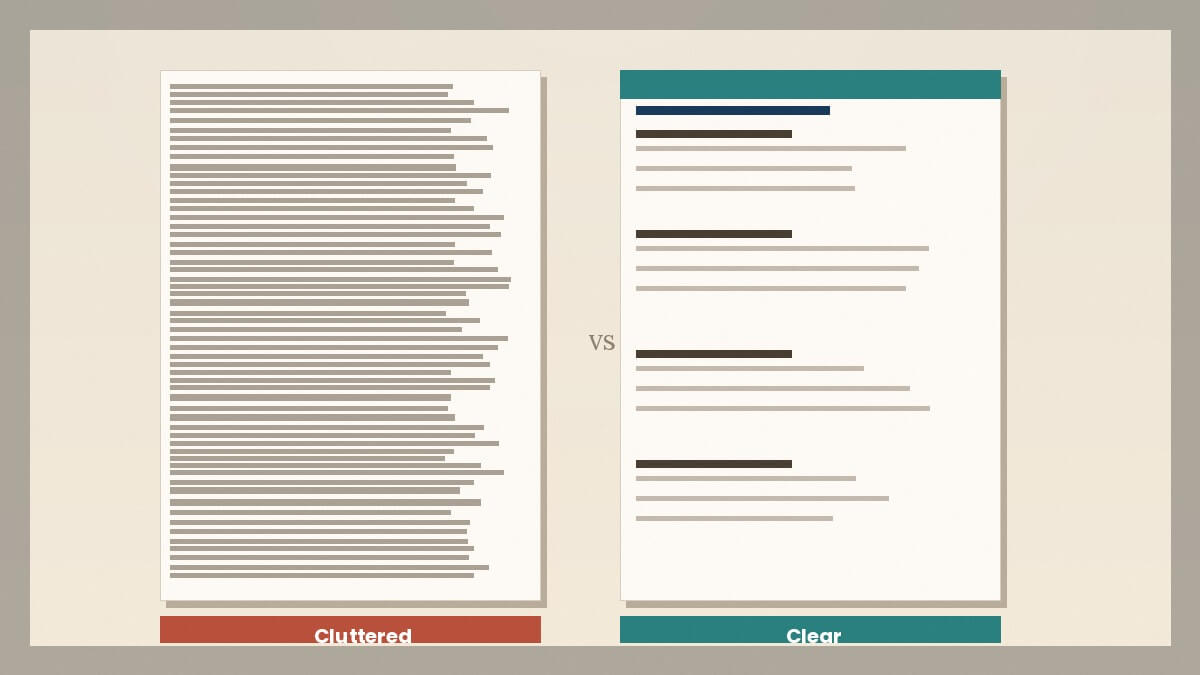
You do not need flashy design. You do need design that feels intentional.
Strong handout design usually means:
Clinicians often use visual quality as a shortcut for judging whether the underlying content is likely to be good. Buyers do the same. That is why design polish matters even when the core value is clinical.
A client handout is not a literature review. If the explanation feels dense, the handout will often go unread.
Specialist language may be accurate, but the resource still needs to be usable. If the client has to decode every second sentence, the handout is doing too much work for itself and not enough for them.
Too many visual elements can make the document feel noisy or childish. Calm structure is usually more powerful than decorative clutter.
A handout should leave the client with a clearer understanding or next step. If it ends without any practical anchor, it often feels incomplete.
Not every handout works the same way across different populations. A resource that lands well with an adult in individual therapy may need significant adjustment for use with adolescents, families, or group settings.
A few practical adjustments worth considering:
For children and adolescents: Shorter sentences, larger print, and concrete examples from daily life. Avoid metaphors that assume adult experience. Visual cues often help.
For parents and support people: Focus on how the concept shows up in behaviour they can observe, and what they can do practically. Avoid language that sounds clinical or evaluative.
For group settings: Streamline the content so a handout can stand alone without extensive explanation. White space matters more here because the clinician cannot always pause to clarify.
For culturally diverse clients: Where possible, review whether the assumptions built into the handout are culturally relevant. Generic wellbeing language can sometimes feel disconnected from specific community contexts.
The best handouts tend to be built for one specific moment and one specific audience, then adapted carefully for others rather than designed to serve everyone at once.
Before listing a handout, ask:
If the answer is yes, the handout is probably close to market-ready.
If you plan to sell the resource rather than only use it in your own practice, read How to sell psychology resources online without looking spammy. It covers the trust signals clinicians look for before buying.
Great psychoeducation handouts are not just attractive PDFs. They are clinical tools that support therapeutic understanding while making the clinician's work easier.
The closer the handout stays to a real session moment, the more valuable it becomes for clients, clinicians, and buyers alike.
Looking for ready-to-use psychoeducation resources? Browse psychoeducation handouts for Australian practice and therapy worksheets for Australian clinicians in the PsychVault library. If you do not like what you see there, or you can design something more useful, become a creator on PsychVault and earn from resources that actually help other clinicians.
Share your thoughts and experiences with this resource.
Sign in to leave a comment
Move from strategy into implementation with templates, handouts, and psychoeducation tools already live on the marketplace.
Publish clinician-grade templates, build trust signals, and start growing an evergreen library under your own brand.
A practical guide for Australian psychologists and allied health clinicians on what neuroaffirming documentation actually means, and how to spot it in the resources you use.
A practical guide to competence boundaries, role drift, and dual relationships in Australian psychology practice, with a focus on when helpfulness becomes a second role.
Most provisional psychologists can tick the insurance declaration. Fewer can explain exactly what is covered, when to notify, and what happens across placements.